Help - HMI
Help - HMI Menu Control
Overview:
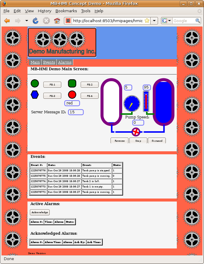
The HTML menu allows the user to select different HMI screens by clicking on different menu selections.
HTML Menus:

The HTML menu system allows multiple "virtual screens" to be contained in a single web page. This allows the entire client to be created as a single file. A single web page is more convenient than multiple files, because there is no simple means for two different web pages to communicate with each other.
To give the appearance of multiple screens, different parts of the same web page are hidden and revealed when the user clicks on different menu selections.

Menu HTML
	<!-- This is the standard nav bar. -->
	<div id="nav">
	<ul>
	<li><a onclick = "ScreenSelect.SelectScreen('mainscreen')">Main</a></li>
	<li><a onclick = "ScreenSelect.SelectScreen('morescreen')">More</a></li>
	<li><a onclick = "ScreenSelect.SelectScreen('chartscreen')">Chart</a></li>
	<li><a onclick = "ScreenSelect.SelectScreen('eventscreen')">Events</a></li>
	<li><a onclick = "ScreenSelect.SelectScreen('alarmscreen')">Alarms</a></li>
	<li><a onclick = "ScreenSelect.SelectScreen('systemstatus')">System Status</a></li>
	<li><a onclick = "ScreenSelect.SelectScreen('testbuttons')">Test Errors</a></li>
	</ul>
	</div>
	// Make a list of all the screens that can be selected.
	var ScreenTable = ["mainscreen", "morescreen", "chartscreen", "eventscreen",
			"alarmscreen",	"systemstatus", "testbuttons"];
	// This creates an object that controls display of the screens.
	var ScreenSelect = new MB_ScreenSelect(document, ScreenTable);
Menu CSS
	/* This handles the navigation (menu) bar. */
	#nav {
		background:tomato;
		font-size: 150%;
		margin-top:0px;
		margin-bottom:0px;
		padding-bottom:2px;
		}
	#nav ul{
		padding-top:5px;
		padding-bottom:5px;
		list-style:none;
		}
	#nav li{
		display:inline;
		}

	#nav a {
		float:left;
		text-decoration:underline;
		color:white;
		background-color:grey;
		border-right:2px solid white;
		padding-top:2px;
		padding-bottom:2px;
		padding-left:5px;
		padding-right:5px;
		}
	#nav a:hover {
		background-color:green
		}
Javascript Library Functions:
The following Javascript library functions are useful for this feature:
- MB_ScreenSelect
Screen HTML
	<!-- ################################################################## -->

	<div id="mainscreen">
	<p><h2>MB-HMI Demo Main Screen:</h2></p>

	<!-- Screen content goes here -->

	</div>

	<!-- ################################################################## -->

	<div id="eventscreen">
	<p><h2>Events:</h2> </p>

	<!-- Screen content goes here -->

	</div>
Screen CSS
/* This controls display of the main screen. */
#mainscreen {
	background:whitesmoke;
	width:1000px;
	display: block;
	}

#mainscreen h2, #mainscreen h3, #mainscreen p {
	padding:0px 10px;
	}

/* This controls display of the events screen. */
#eventscreen {
	background:whitesmoke;
	width:1000px;
	display: none;
	}
#eventscreen h2, #eventscreen h3, #eventscreen p {
	padding:0px 10px;
	}
How it works:
The menu is implemented as a simple unordered list. A simple CSS style is then applied to it to cause the list to extend sideways instead of vertically. The CSS style also applies a background, padding, and separators to give the appearence of a menu. A "hover" property is then applied to it to cause the menu item to change colour when the mouse cursor passes over it.
Each "virtual screen" is enclosed in a pair of "div" tags. The "id" for each div is then given a CSS style. The MB_ScreenSelect library class is initialised with a list of all the screen div "id" strings. To select a screen, the SelectScreen method for the menu object is then called with the desired id string. The new screen is then revealed and the old screen is hidden.
Visibility of the "virtual screens" is controlled by manipulating the "display" in the CSS. When display is set to "block" (display: block;), the screen is visible. When it is set to "none" (display: none;), the screen is hidden. In the CSS file, the default screen should be set to "block" and all others to "none" so that only one screen is visible at start up.
Any number of screens may be handled in this way.
Menu Styling:
Different menu visual styles can be achieved by applying CSS styles. This is not an in depth tutorial on HTML and CSS, but another example is given here to show what can be done.
Horizontal List:
This shows a simple list turned into a horizontal menu. Below are also shown the HTML and CSS styles used to achieve it.

HTML for Horizontal List:
	<div id="nav">
		<ul>
		<li><a onclick = "ScreenSelect.SelectScreen('mainscreen')">Main</a></li>
		<li><a onclick = "ScreenSelect.SelectScreen('morescreen')">More</a></li>
		<li><a onclick = "ScreenSelect.SelectScreen('chartscreen')">Chart</a></li>
		<li><a onclick = "ScreenSelect.SelectScreen('eventscreen')">Events</a></li>
		<li><a onclick = "ScreenSelect.SelectScreen('alarmscreen')">Alarms</a></li>
		<li><a onclick = "ScreenSelect.SelectScreen('systemstatus')">Status</a></li>
		<li><a onclick = "ScreenSelect.SelectScreen('testbuttons')">Test</a></li>
		<li><a href="/hmidemo2.xhtml">Demo 2</a></li>
		</ul>
	</div>
CSS for Horizontal List:
	/* This handles the navigation (menu) bar. */
	#nav {
		background:tomato;
		font-size: 150%;
		margin-top:0px;
		margin-bottom:0px;
		padding-bottom:2px;
		}
	#nav ul{
		padding-top:5px;
		padding-bottom:5px;
		list-style:none;
		}
	#nav li{
		display:inline;
		}

	#nav a {
		float:left;
		text-decoration:underline;
		color:white;
		background-color:grey;
		border-right:2px solid white;
		padding-top:2px;
		padding-bottom:2px;
		padding-left:5px;
		padding-right:5px;
		}
	#nav a:hover {
		background-color:green
		}
Vertical List:
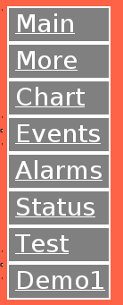
This shows a simple list turned into a vertical menu. Below are also shown the HTML and CSS styles used to achieve it. Notice that the actual HTML is identical, while the effect is achieved through some minor changes in the applied styling.

HTML for Vertical List:
	<div id="nav">
		<ul>
		<li><a onclick = "ScreenSelect.SelectScreen('mainscreen')">Main</a></li>
		<li><a onclick = "ScreenSelect.SelectScreen('morescreen')">More</a></li>
		<li><a onclick = "ScreenSelect.SelectScreen('chartscreen')">Chart</a></li>
		<li><a onclick = "ScreenSelect.SelectScreen('eventscreen')">Events</a></li>
		<li><a onclick = "ScreenSelect.SelectScreen('alarmscreen')">Alarms</a></li>
		<li><a onclick = "ScreenSelect.SelectScreen('systemstatus')">Status</a></li>
		<li><a onclick = "ScreenSelect.SelectScreen('testbuttons')">Test</a></li>
		<li><a href="/hmidemo.xhtml">Demo1</a></li>
		</ul>
	</div>
CSS for Vertical List:
	/* This handles the navigation (menu) bar. */
	#nav {
		background:tomato;
		font-size: 150%;
		float:left;
		width:100px;
		margin:5px;
		}

	#nav ul	{
		margin: 0;
		padding: 0;
		list-style-type: none;
		}

	#nav a	{
		display: block;
	 	text-decoration:underline;
		color: white;
		background-color: grey;
		width: 100px;
		padding-top:2px;
		padding-bottom:2px;
		padding-left:7px;
		padding-right:5px;
		border-left:2px solid white;
		border-right:2px solid white;
		border-top:2px solid white;
		border-bottom:2px solid white;

		}
	#nav a:hover {
		background-color:green
		}